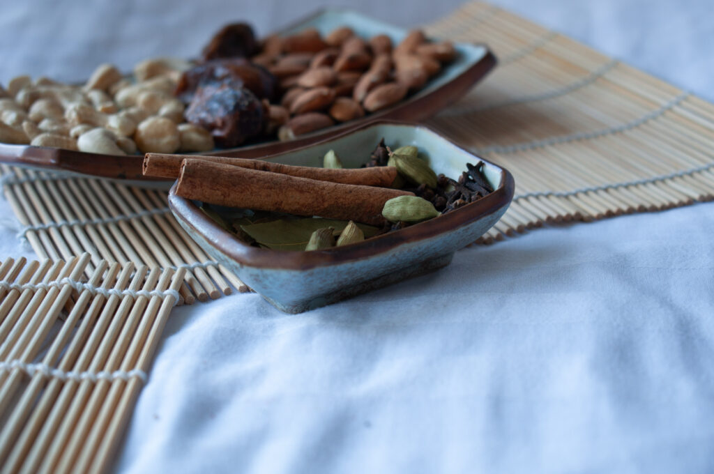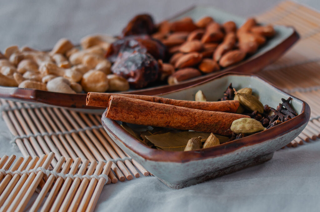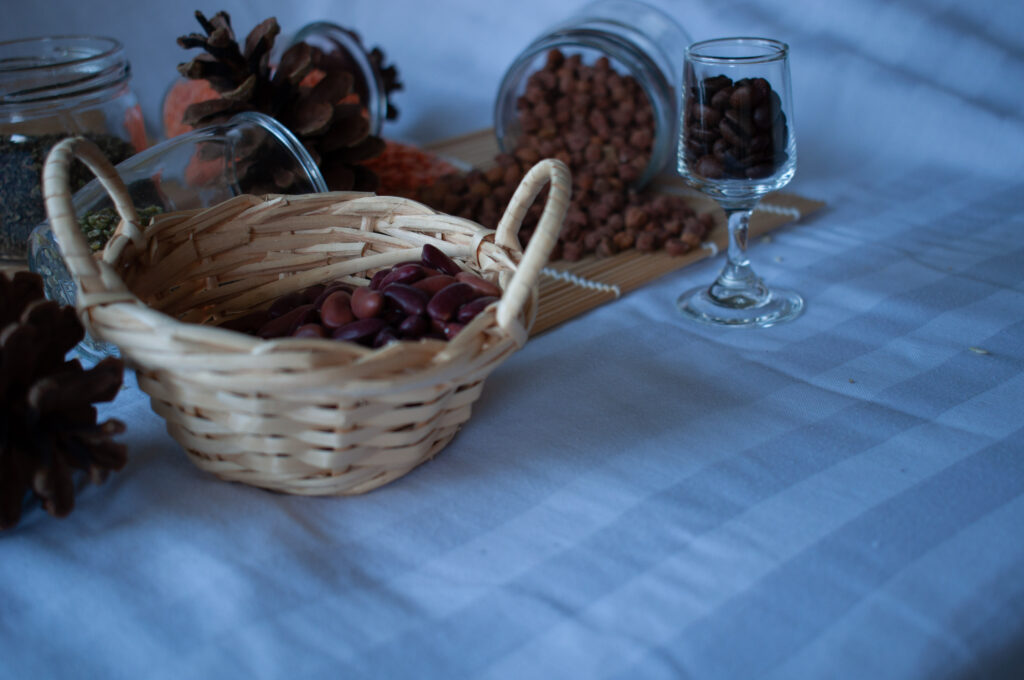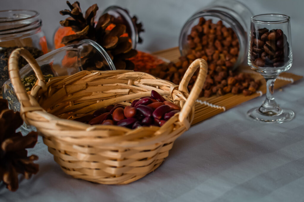
Food Photography
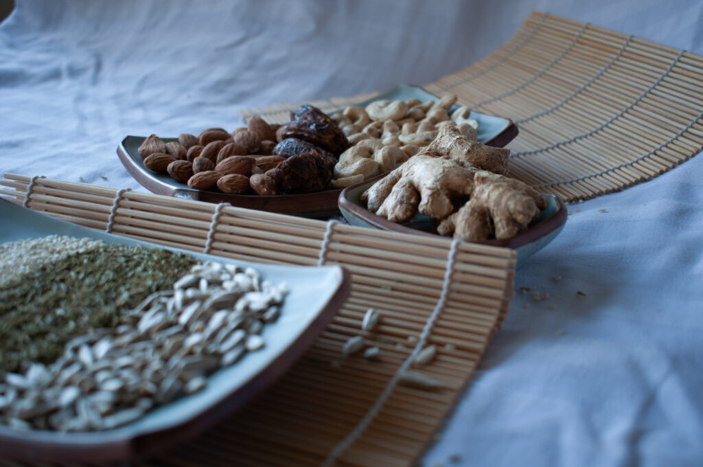
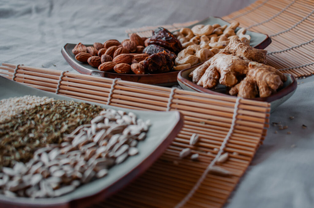
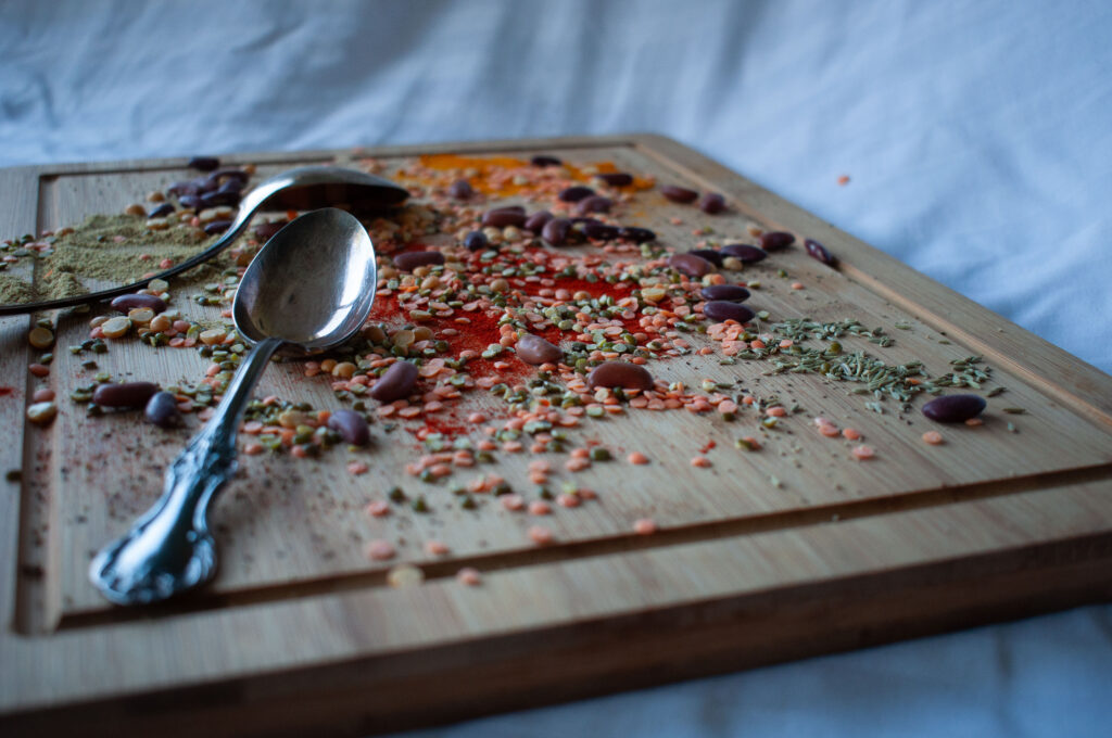
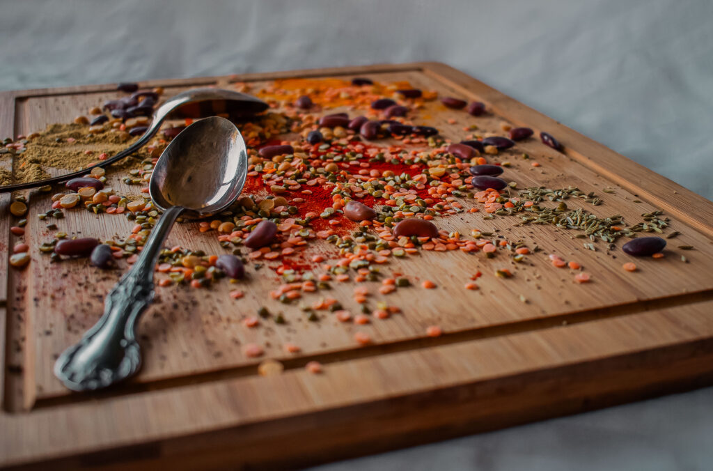
I wanted to try a few things for this project, but not being able to decide what direction to take made it a bit complicated. After much thought and having discussed it with Angela, I wanted to try taking pictures of spices. I’m from India, and spices reminded me of home, as stereotypical as it is, it is true. I also wanted to take pictures of some grains and lentils, I thought it would work well with the spices. So, here’s my work for Unit 2.
Photoshoot 1
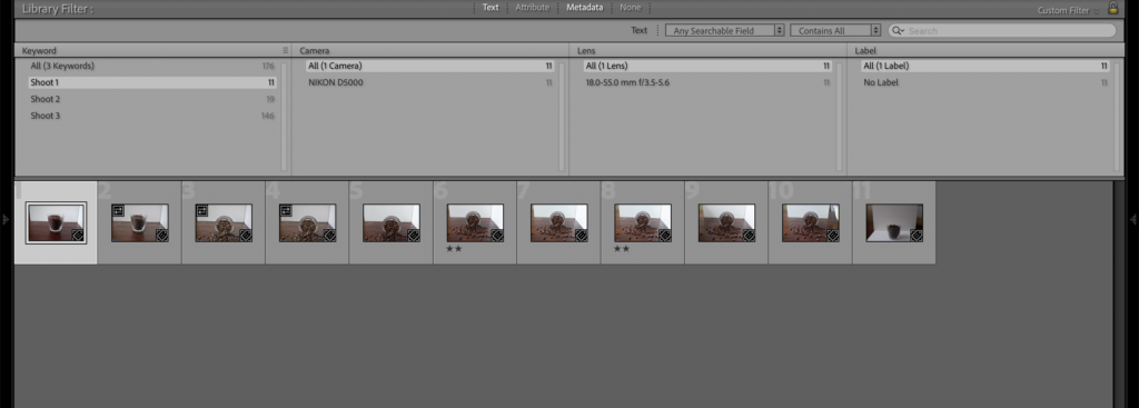
For the first photo shoot, I couldn’t quite the angles right. Some of the images turned out pretty good, but they did not quite align with what I had in mind. Unfortunately, I forgot to take a picture of the setup, so, I’ll just describe it the best I can. I took all of my images on my kitchen table by the window. I used a white wooden board to reflect some of the light on my subject. The window was on the left, with a white board behind the subject and one on the right.
Photoshoot 2
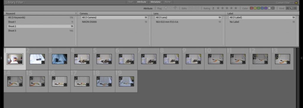
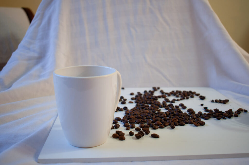
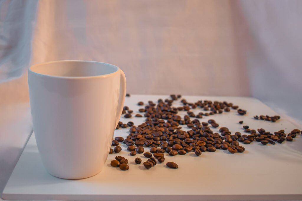
For my second photoshoot, I used my kitchen table again, but this time, instead of the whiteboards, I used a white sheet. I did an awful job at it and did not like most of the pictures again. I’m not sure if it was the light, or if it was just my tripod angle, it just did not look like I wanted it to. I also ended up taking some photos with the wrong ISO, so had to discard most of them.
Photoshoot 3
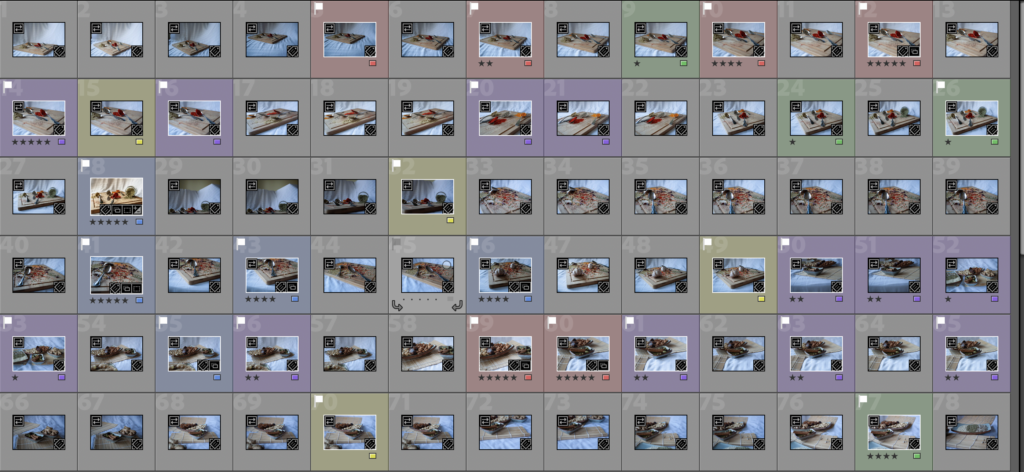
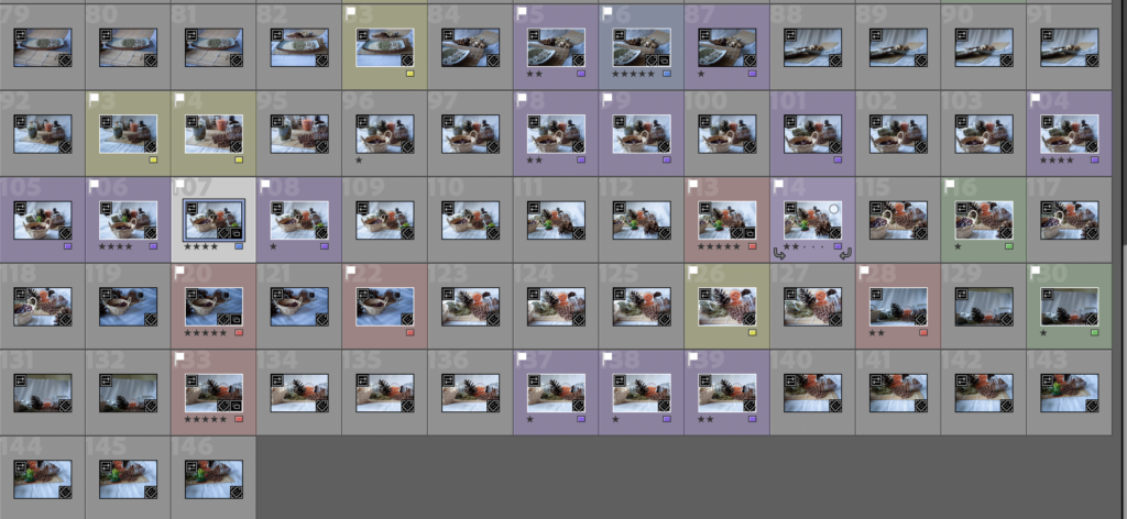
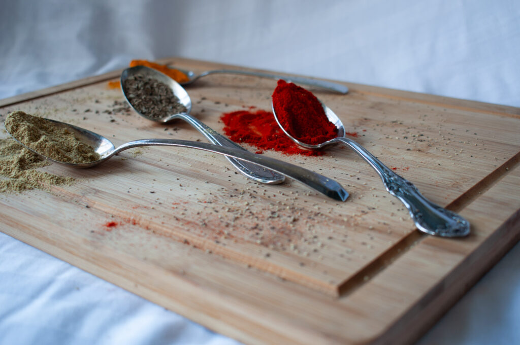
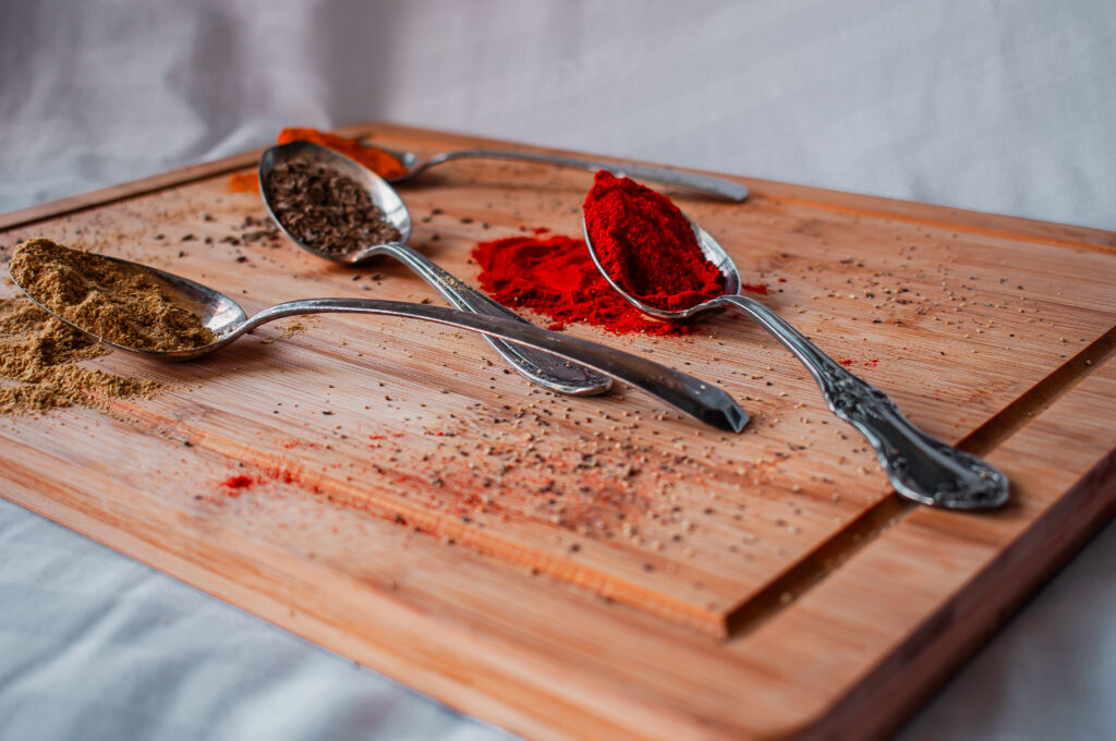
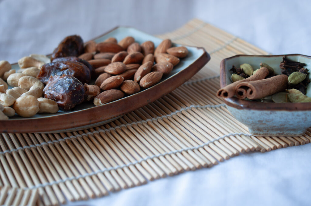
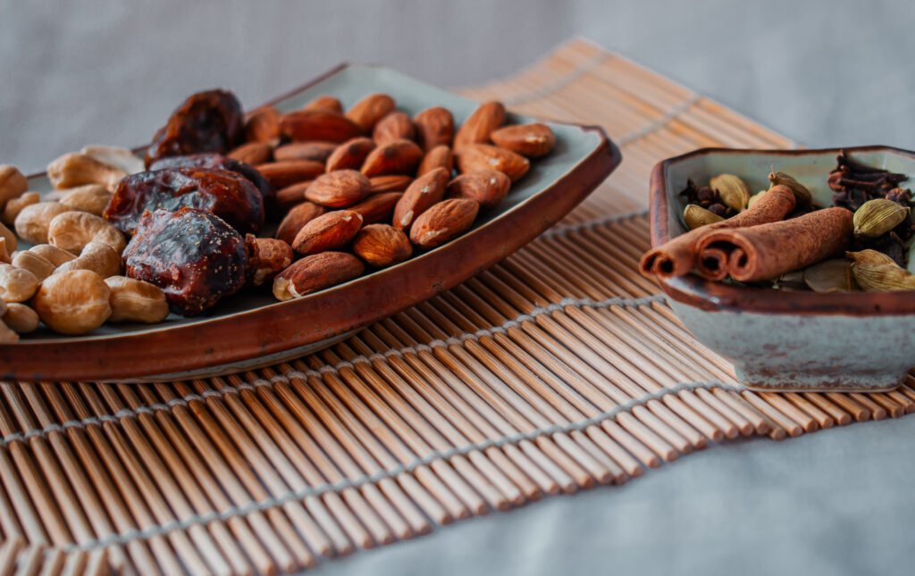
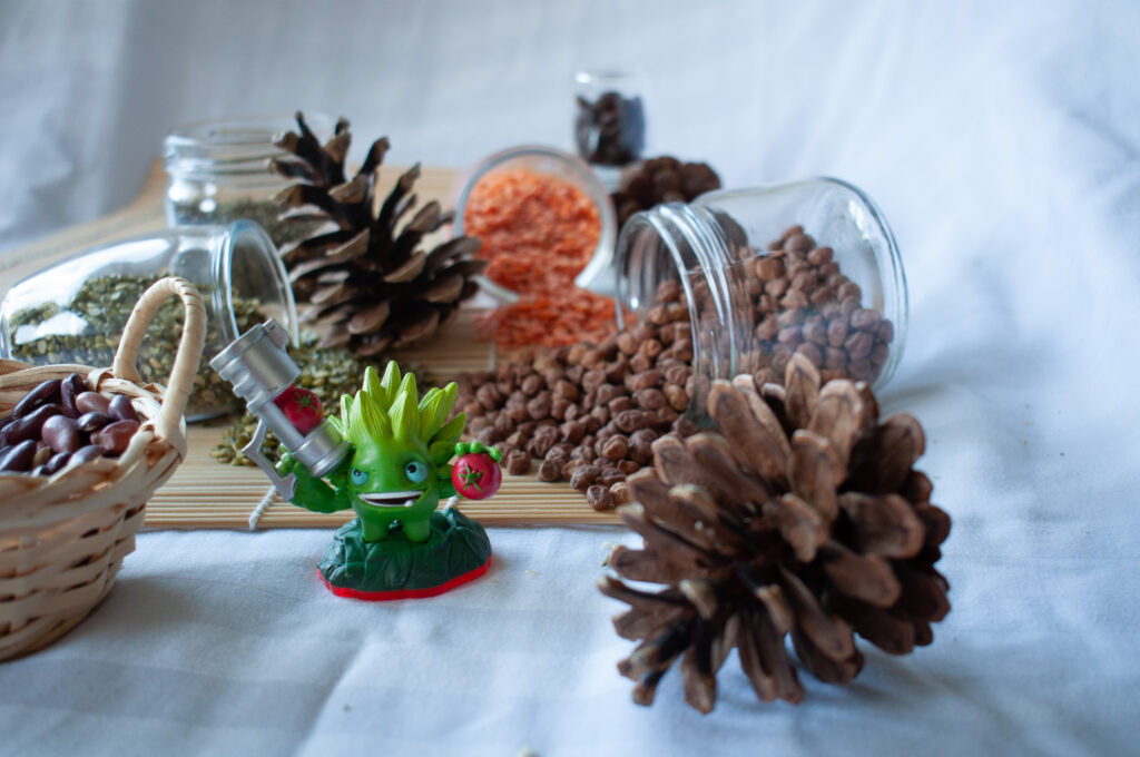
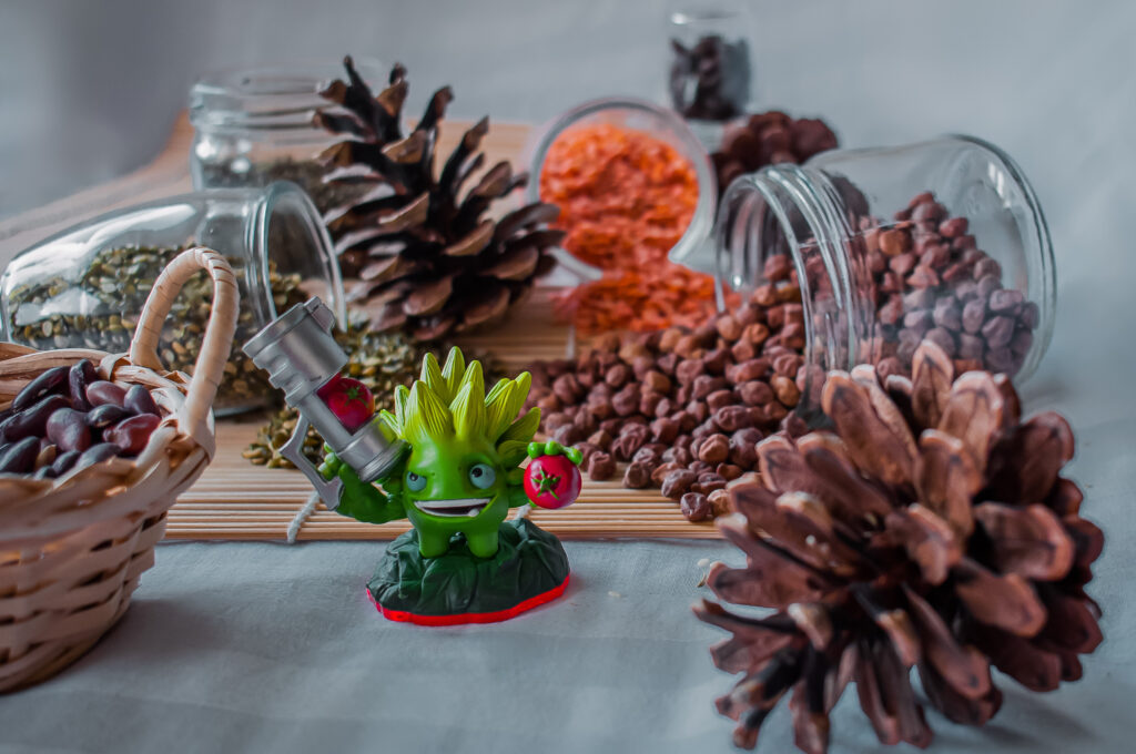
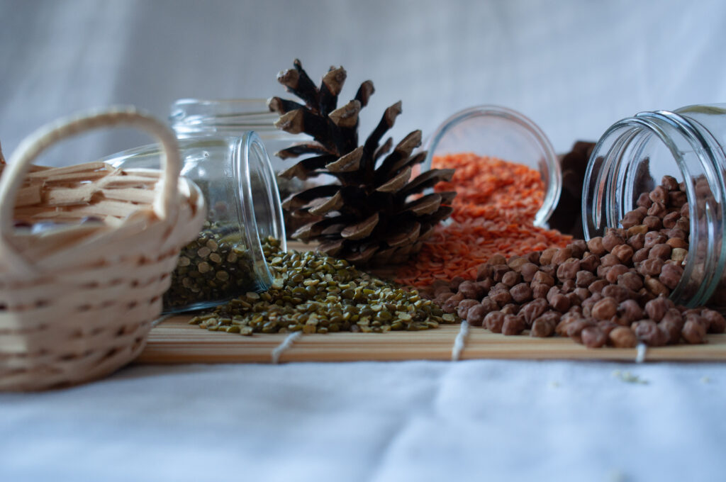
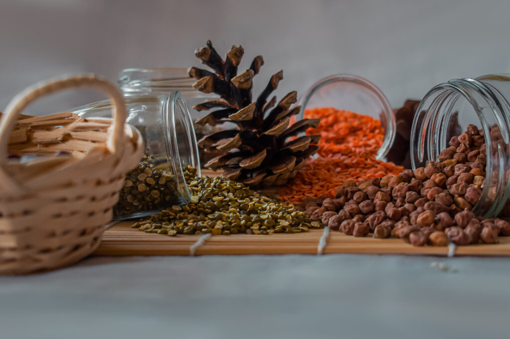
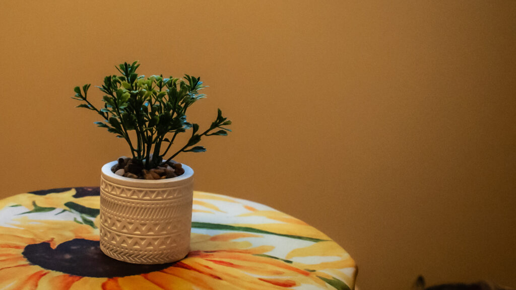
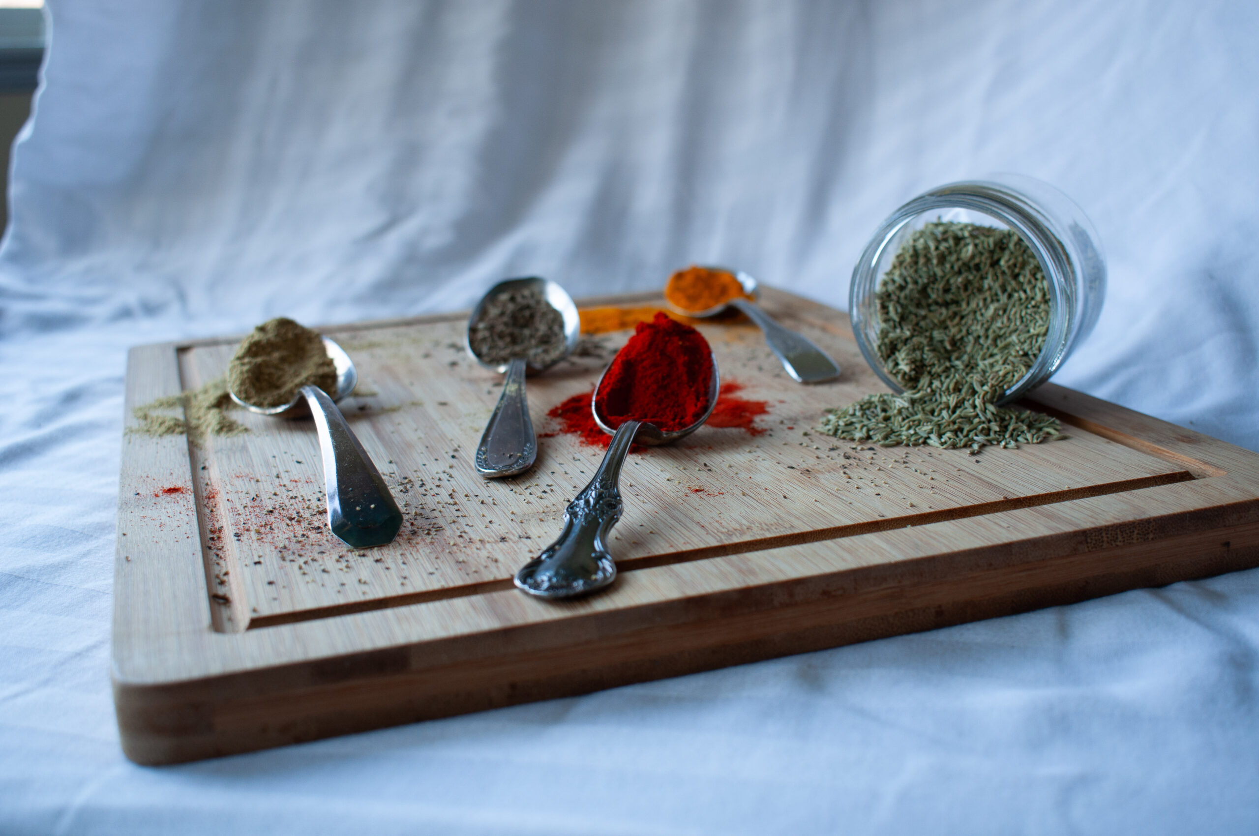
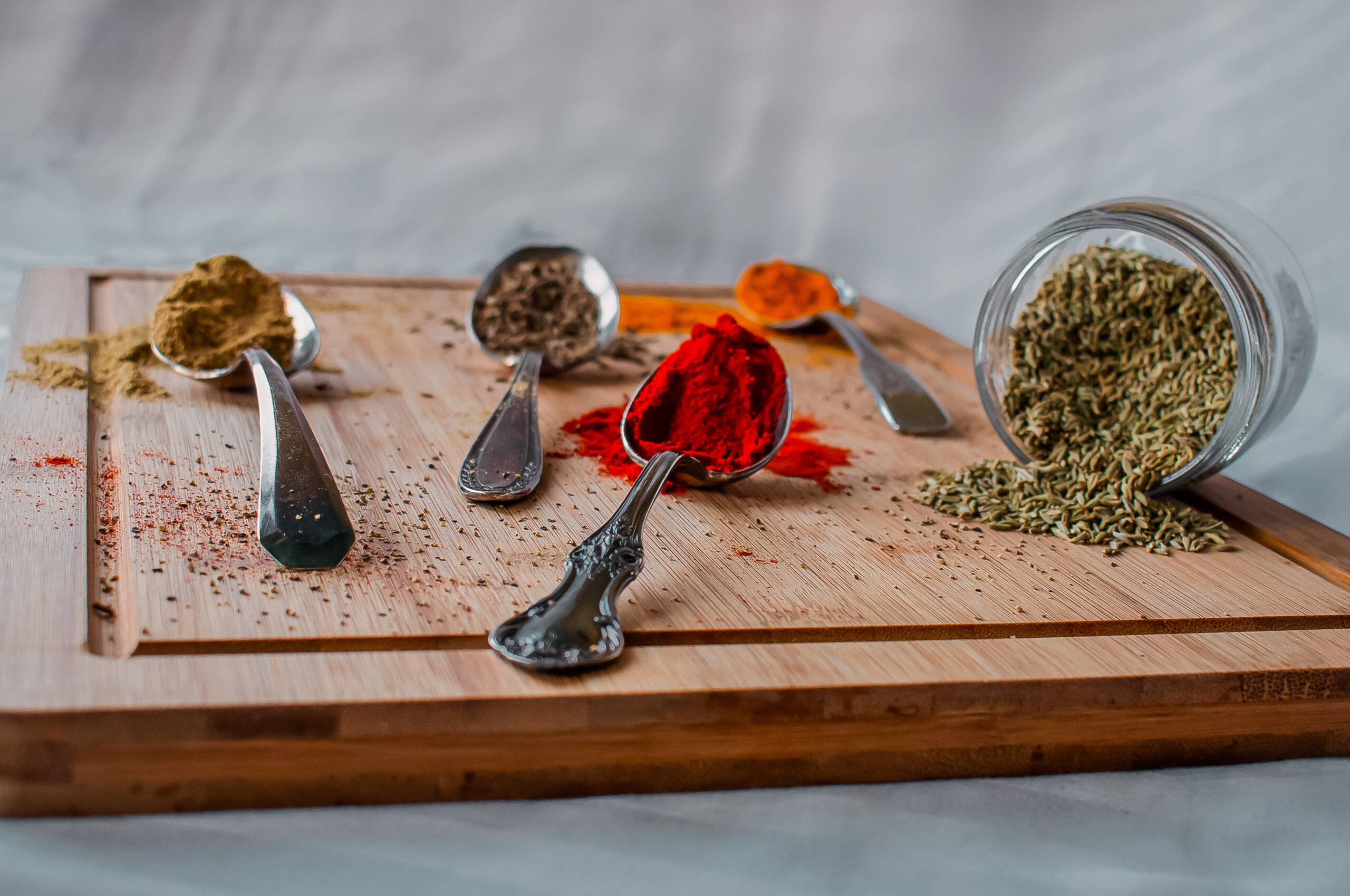
For my third photoshoot, I went a little crazy and took way too many photos, which later really confused me while shortlisting them because they looked too similar. But I somehow managed to do it, and most of my final images were from the third photoshoot. I didn’t realize it while I was doing it, but working with a white background is not very easy, especially if you have a thousand wrinkles in the fabric. As it was the first time I was doing it, I thought I could fix it in the editing. I did fix some things, but I realized that it is much easier to just take the photo the right way. I really struggled with making my studio setup behave like I wanted it to, but I think it turned out okay in the end.
Experience
My overall experience with this project was quite interesting. It was fun in a lot of ways when I got to try out new things. The novelty aspect of the project made it really appealing. But at the same time, it was really challenging too, because I made all the rookie mistakes. I also couldn’t submit it, even after having finished it, because my brain refused to cooperate. I ran into some hiccups, but I’m glad I finished it.
This assignment also made me realize that editing can be a very very long process, and it can make your eyes feel like they have seen too much for the day. It was the first time I got to play around with a camera tripod, and I found it a lot easier to take good photos due to the controlled environment.
I do think that I need to learn a lot when it comes to editing, it is not something that comes super naturally to me. I just tweak things until they look good to me, but the problem here is, that my idea of good can be very subjective and different from what good editing actually is. For the time being, I’m just doing what looks good to me, and I can only hope that it looks good to you too.
One of the things that I struggled most with, was the background. I made a mistake when it came to choosing the right material for the background. I didn’t realize that it could be that hard to work with. The wrinkles and unevenness took so long to fix in the photoshop. Initially, I tried to make the background very smooth using a single colour, giving it a very studio-type vibe. But unfortunately, it really did not work for my images. So, I had to find a way to keep the original background, and somehow make it presentable. I tried my best, but I’d love to hear about what you think.
After having done it like this, I don’t think I will use a fabric for a studio again, especially a wrinkly white fabric. I haven’t done it yet, but something tells me that black is a lot more forgiving. Maybe, I will try that next time. So, yeah, many valuable lessons were learned with this project. Please share if you have any thoughts, ideas, or advice for me.
Thank you
Tech Ex Images


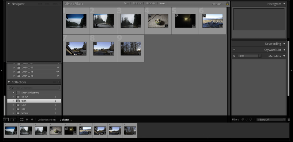
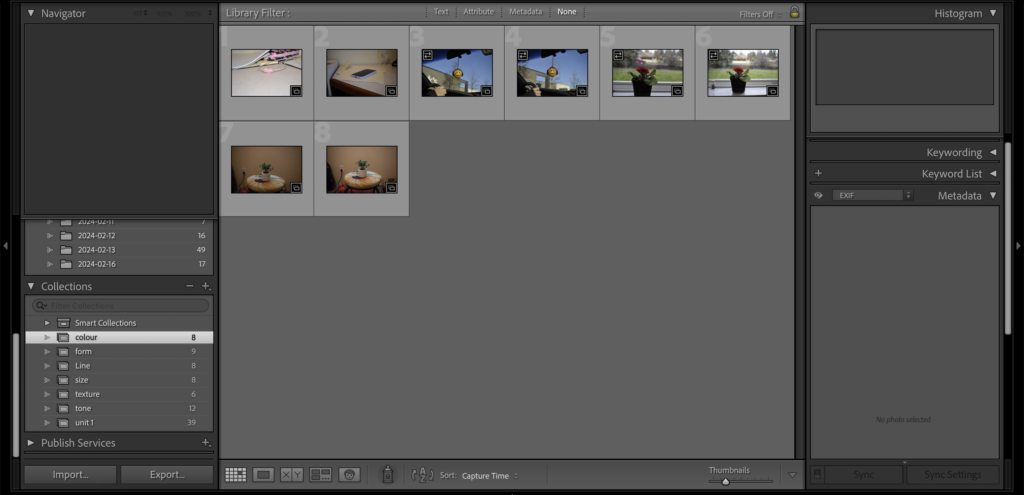
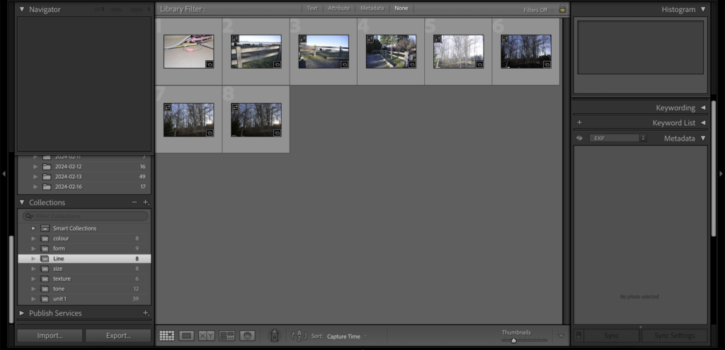
The Final Series